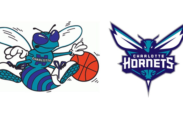
The new Charlotte Hornets logo, coming soon to a jersey near you

The Charlotte Hornet scares us.
Yes, we meant to make that singular. We're not sure whether the Hornets -- as next season's Charlotte NBA team will be known, bringing back the club's name that traveled to New Orleans when the original franchise moved -- will intimidate anyone. But the new logo (revealed Saturday by the club)? Ooooh, scary.
Start with that wingspan. Very expansive. And we all know how important wingspan is in the NBA — more blocked shots and rebounds.
Then check out that stinger. This Hornet is one bad mutha-(shut your mouth!). You going to try boxing out that guy? Didn't think so.
Contrast the new Hornet with the original. The old one looked like a cool dude sporting shades. He might blow by you in a pickup game, but he wasn't threatening you with his stinger.
In a press release sent out preceding a lavish unveiling ceremony Saturday, the Charlotte club said this about the new logo: "The primary logo utilizes the purple and teal color palette and features an aggressive-looking hornet that is ready to attack. Its piercing eyes, raised antennae, expanded wings and pointed stinger depict its relentless intensity."
Yeah, and you know what else the new Hornets logo makes us think of? The tracker jackers from "Hunger Games." Gives us the shivers just to remember them.
Now, the "Buzz City" thing to promote the team is all well and good, but now that chairman Michael Jordan's team has a little more edge, let us offer a few slogan suggestions for the Hornets to match their buzzier logo . . .
• We're the Hornets. Do NOT call us wasps.
• Your Charlotte Hornets: You never know when the owner might decide to suit up.
• The Charlotte Hornets: Our bee could kick the (BLEEP!) out of a pelican, and Bobcats are allergic.
• The Hornets: Tougher to swat than our former cross-dressing superstar who used to dress like Grandmama.
• The NEW Charlotte Hornets: Keepin' it teal.


