


2024 MLB City Connect uniforms: Cleveland drops 'Guardians of Traffic'-inspired look
It's the Cleveland Guardians' turn to drop their City Connect uniforms.
The Guardians became the 25th team to release a City Connect jersey with the, Guardians of Traffic pillars on the Hope Memorial Bridge outside Progressive Field — the same landmark that inspired the team's 2021 mascot change — providing a major inspiration for the look.
The jerseys have the abbreviated term for Cleveland, "CLE," in big letters across the chest. The style of the wordmark and jersey numbers is similar to the Art Deco style of the Guardians of Traffic pillars, appearing to be etched in stone to match the pylons at the base of each statue.
The jersey tops are blue with a texture that appears like the Berea Stone that was used to carve the Guardians of Traffic pillars. Meanwhile, the sides have red, white and blue braiding with a texture similar to what's seen in the middle of the Guardians of Traffic pillars. The stripes were also inspired by Cleveland's uniforms from the 1990s.
Other features include "THE LAND," Cleveland's nickname, being displayed above the tag. It also has "1901" written inside the neck, which is the year the franchise was established.
The primary "C" logo on the Guadians' regular caps remains the same for the City Connect look. However, they have a white base in the front, a blue base in the back and the "C" logo is colored red, keeping with the team's tradition of having red, white and blue as its uniform colors.
Cleveland native and Grammy Award-winning recording artist Kid Cudi helped unveil the uniforms in a video posted by the team late Sunday night, culminating a three-year-long jersey design process.
Cleveland's City Connect uniforms appear to already be hit among Guardians players. Josh Naylor asked members of the team if they could wear the uniforms in every home game this season while Steven Kwan said they're a "fire" look.
Naylor will not have to wait much longer to wear the uniforms. The Guardians will debut them on Friday when they face the Minnesota Twins. They're expected to wear them in every Friday home game for the remainder of the season, but could also wear them on other days as well.
Detroit Tigers
The Tigers became the 24th team to unveil the alternate look, releasing their City Connect uniforms on Monday, May 6. They embraced the city's history with the automotive industry. The uniforms have "MOTOR CITY" written across the chest, the most common nickname for Detroit, in a similar automotive-inspired font to the one that the Detroit Lions' NFL uniforms bore until recently.
That served as the all-around theme for the Tigers' City Connect uniforms. Tire tracks shaded in electric blue run down the middle on both sides of the jersey.
There's an arm patch as well, which is similar to the "M-1" road signs seen on Woodward Avenue in Detroit. The 21-mile-long road runs from the center of Detroit and up North to Pontiac, earning the moniker "Detroit's Main Street." Comerica Park is among many of the notable things located along Woodward Avenue. The patch also has Detroit's 313 area code, with the "1" being bolded to further emphasize the "M-1" road sign.
The ballcaps have the city's name, simply saying "DETROIT" across the front. But there are a pair of other notable features. Tiger eyes are on the bottom side of the brim. They also have a tag that looks similar to a VIN tag you would see on a car. The Tigers' VIN tag reads as "DET190135456884." The numbers represent the year the Tigers were established (1901) along with the four years they won the World Series (1935, 1945, 1968, 1984).
The tiger eyes that are on the bottom of the brim of the cap are also seen above the tag of the jersey.
"The City Connect uniforms represent Detroit's unique combination of muscle and innovation and pay homage to the city that put the world on wheels," Ilitch Sports + Entertainment president/CEO Ryan Gustafson said in a statement. "From the tire treads to the VIN tag to the M-1 patch on the sleeve, there are unique features on the uniforms, caps and batting helmets we feel Tigers fans and Detroiters will appreciate. Above all, the uniforms are symbolic of the revitalization and exciting future ahead for the Tigers and our great city."
To help further embrace their local roots, the Tigers had rapper Eminem take part in the unveiling of their City Connect uniforms. Eminem is a Detroit native and avid fan of the city's sports teams, and recently appeared with NFL commissioner Roger Goodell to help promote the 2024 NFL Draft.
Philadelphia Phillies
The Phillies were the first team to unveil their City Connect uniforms this season. "PHILLY" is written across the chest in white coloring while the uniform's colors resemble the city's flag. The cap's logo is the Liberty Bell with the same coloring as the city's flag, which has Philadelphia's skyline placed within the logo.
[Want great stories delivered right to your inbox? Create or log in to your FOX Sports account, follow leagues, teams and players to receive a personalized newsletter daily.]
New York Mets
The Mets introduced their City Connect uniforms in April. It's a base gray uniform with "NYC" stitched on the front and the Queensboro Bridge on the hat. The jersey also has a black patch on the arm with the Mets logo in pink lettering.
[Read more: New York Mets release 'City Connect' jersey with new color scheme]
Tampa Bay Rays
Tampa Bay unveiled its City Connect uniforms on April 29, becoming the 23rd MLB team to embrace the alternate look since the Nike-backed brand launched in 2021.
The Rays' City Connect uniforms have "Tampa Bay" written across the chest in neon coloring, a similar look they had on their road jerseys in their first three seasons as a franchise (1998-2000), to go with the dark base. It marks the first time the Rays will have their city name written across their chest since 2007.
Tampa Bay's skater culture inspired some of the look. The flames coming off each letter on the nameplate on the front of the jersey include flames, which are meant to honor street art and skate media, such as "Thrasher" magazine. Gradient accents cover the sleeves and pants of the uniforms, purposely making them asymmetrically as a symbol of doing things differently.
The Rays wanted to capture the feel of what it's like to be in Tampa Bay, displaying a look of what people see when they're in the city and calling it "Grit and Glow."
"When we started thinking about that feeling that you have when you're in some of these really special places around this community, it's fueled by this energy," Rays chief business officer Bill Walsh said in a statement. "A lot of these types of countercultures, creative cultures, they're really at the center of that in terms of creating that vibe."
The Rays honored some local landmarks with their caps and logos. The main logo on the caps features the Sunshine Skyway Bridge in the outline of a sting ray. A second logo has three palm trees and a pelican. The palm trees logo replicates the mark seen on Florida Historical Makers, such as Perry Harvey Sr. Park, Florida's first public skatepark. The other logo is a stingray on a skateboard, further embracing the city's skater culture.
"It's also something we think that we have in common as an organization," Walsh said of Tampa Bay's skater culture in the statment. "We have demonstrated that, that you've kind of got to be willing to go against the grain and have some courage and disrupt. So I think it's exciting that there's that overlap, too."
The Rays will debut the uniforms in their three-game home series against the New York Mets this season. They'll wear the alternate look in every Saturday home game after that.
Other teams set to unveil City Connect uniforms in 2024
- Los Angeles Dodgers (will release their second look after releasing first look in 2021)
- Minnesota Twins
- St. Louis Cardinals
- Toronto Blue Jays

Aaron Judge, Bryce Harper lead Ben Verlander's Team of the Week

2024 MLB Power Rankings: Are the Phillies the best team in baseball?
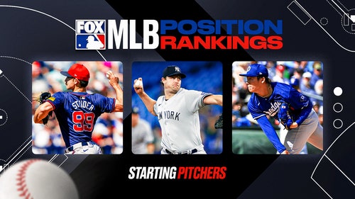
20 Best pitchers in MLB 2024: Ranking the top 20 starters

Astros' Ronel Blanco suspended 10 games for foreign substance violation
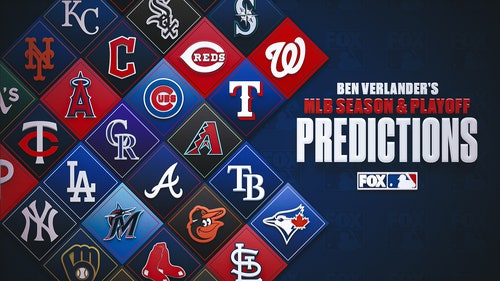
2024 MLB predictions by Ben Verlander: Standings, playoffs, World Series
-
Aaron Judge, Bryce Harper lead Ben Verlander's Team of the Week
2024 MLB Power Rankings: Are the Phillies the best team in baseball?
20 Best pitchers in MLB 2024: Ranking the top 20 starters
-
Astros' Ronel Blanco suspended 10 games for foreign substance violation
2024 MLB predictions by Ben Verlander: Standings, playoffs, World Series